
The way we interact with the web has changed!
No longer are people only accessing the internet through their desktop computer. People now access websites through mobile phones, portable tablets like the iPad, and even gaming devices.
A traditional website can be cumbersome to use because it assumes you are on a desktop computer with a large screen. The result of looking at the site like this on a smartphone means you have to do a lot of pinching and zooming.
Mobile First
Mobile devices need to be the first thing to consider when building or redesigning a website. No longer can a mobile version of a website be an afterthought. Dedicated mobile sites and responsive website design provide solutions to focusing on the mobile market.
Did you know?
- By 2013 more people will be using smartphones to get on the internet rather than using their PCs.
- 57% of people would not recommend a business with a bad mobile site?
- 40% of people will go to a competitors website if they have a bad mobile experience.
Sources: Gartner 2010, Compuware "What Users Want from Mobile" 2011
Responsive Website Design
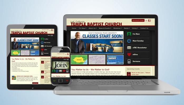
Our current tool of choice for mobile first design is responsive website design. Instead of having 2 websites (one for desktop computers and one for mobile phones) responsive design changes a websites layout based on the screen size. What this means is that you have 1 website that adjusts itself to look good on any device size.
The advantage is that you do not have multiple websites to maintain. Everyone will see the same content on your website. The difference is that the user experience a person has is much better. It will feel as though the website was designed just for the device they are viewing the site on.